
Neutral color palettes might sound like a snooze-fest, but they’re the secret sauce to creating a space that’s both chic and inviting. Imagine walking into a room that feels like a warm hug, where every shade whispers sophistication. These understated hues can elevate your design game without shouting for attention.
Overview Of Neutral Color Palettes
Neutral color palettes consist of colors that lack strong saturation, often creating a harmonious backdrop in various settings. These palettes typically include shades like beige, gray, white, and taupe. Such colors often evoke a sense of tranquility and balance, contributing to a soothing environment. By incorporating neutral tones, designers can highlight focal points or decorative elements without overwhelming the senses.
Textures play a significant role within neutral palettes. Soft fabrics like linen, cotton, and wool enhance the richness of these hues, adding depth to the overall design. Various finishes, such as matte or glossy, can also influence the perception of neutral shades, making them versatile for different styles.
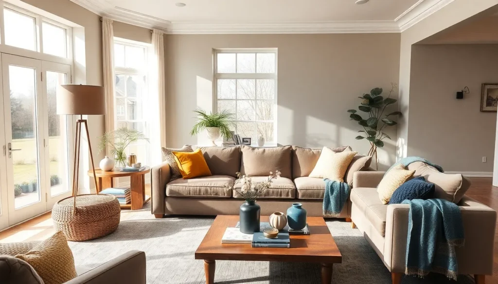
Using accents is essential for maintaining visual interest. Pops of color through furniture, art, or accessories can breathe life into a neutral space. For example, pairing a charcoal gray sofa with vibrant throw pillows introduces a dynamic contrast.
Neutral color palettes find extensive application in modern home designs and offices. They can effortlessly adapt to different aesthetics, from minimalistic to rustic. Such versatility makes them popular among homeowners and designers alike.
Overall, these palettes balance functionality and aesthetics. Selecting the right combination of neutral tones provides a timeless foundation for any interior space.
Benefits Of Using Neutral Colors
Neutral colors offer numerous advantages in interior design. They create serene environments while maximizing aesthetic appeal.
Versatility In Design
Versatility defines neutral colors in design applications. These shades work well with various styles, including modern, traditional, and bohemian. They easily transition through different themes, ensuring seamless integration into any space. Designers appreciate their adaptability when updating seasonal decor or rearranging furniture. Neutral palettes harmonize effortlessly, making bright or bold accents pop without overwhelming the overall scheme. Properties featuring neutral hues attract potential buyers due to their broad market appeal. Given their timeless quality, they remain relevant regardless of changing trends.
Enhancing Other Colors
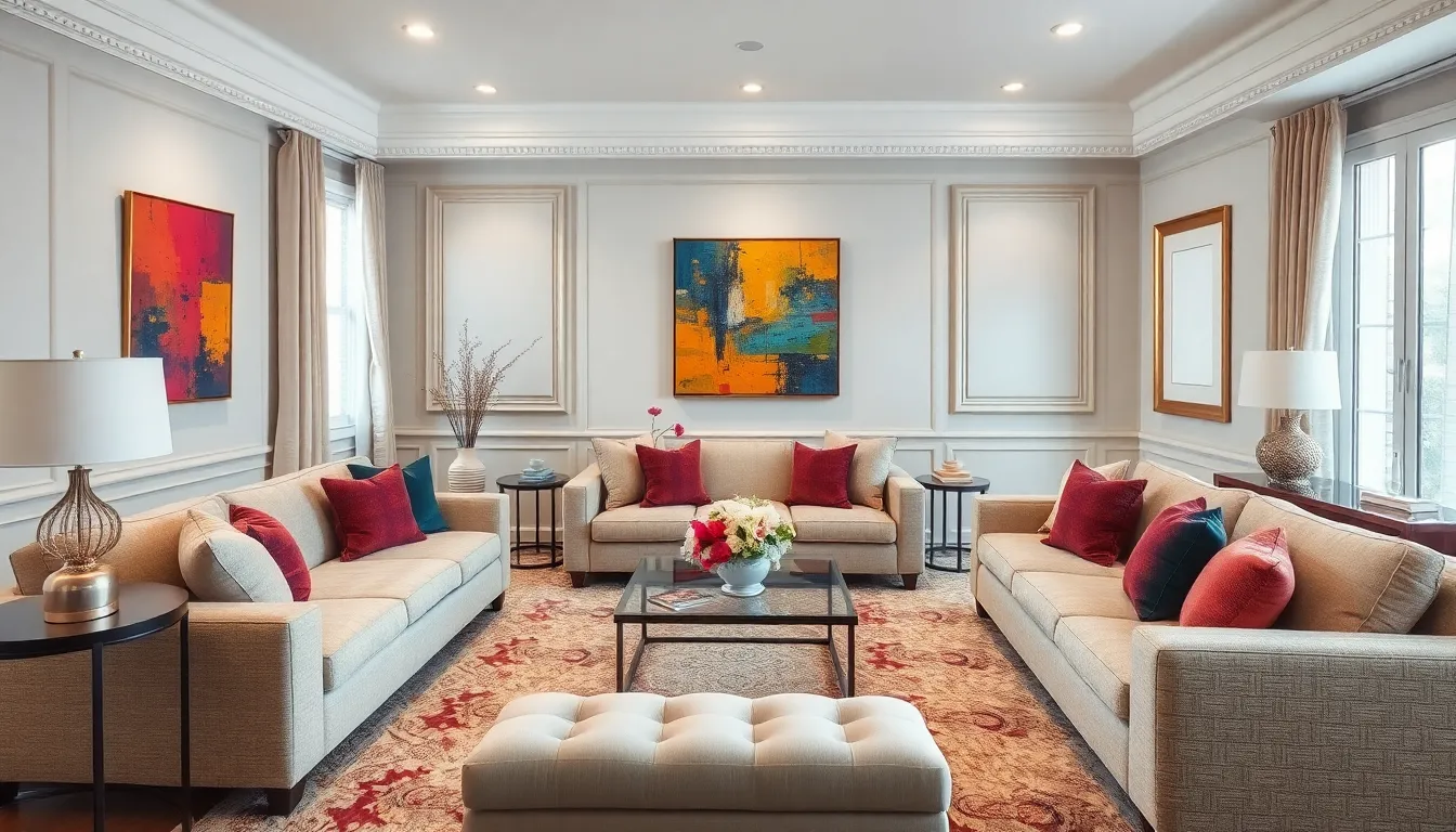
Enhancing other colors represents a significant benefit of neutral hues. These shades serve as a backdrop that allows accent colors to stand out, creating vibrant focal points. Designers can pair light grays with rich jewel tones for a sophisticated look. Warm beiges complement deep blues, evoking a cozy atmosphere. Accessories, such as artworks or upholstery in bold colors, thrive in neutral spaces. By doing so, spaces maintain balance and visual intrigue. Overall, using neutral colors effectively highlights selected elements within a room while maintaining a cohesive design scheme.
Popular Neutral Colors
Neutral color palettes encompass various shades that enhance their calming effects. Specific shades provide warmth, elegance, and versatility across different spaces.
Shades Of Beige
Beige serves as a warm neutral, providing comfort and a sense of coziness. This color integrates seamlessly with other shades, allowing for flexibility in decorating styles. Light beige tends to open a room, making spaces feel airy, while darker variations ground the ambiance. Designers frequently utilize beige as a base, pairing it with bold accent colors. Its ability to evoke tranquility makes it a popular choice for living areas and bedrooms.
Grays And Whites
Grays and whites create a sophisticated and clean aesthetic in any space. Soft gray adds depth without overpowering, allowing light to fill the room. Bright whites reflect natural light, enhancing the overall brightness of the area. Combining these shades can establish a modern and chic atmosphere. Accent features in darker or vibrant colors can pop against this subtle backdrop, preserving visual interest while maintaining a serene vibe.
Earthy Tones
Earthy tones include shades like taupe, warm browns, and muted greens, providing a grounded and organic feel. These colors evoke a sense of nature, bringing calming elements indoors. Incorporating these tones can create a harmonious environment, perfect for fostering relaxation. Designers often enhance these shades with textures and natural materials, amplifying the warmth and inviting nature of the space. Simple pops of color through furniture or art can add liveliness while preserving the overall serene backdrop.
Combining Neutral Palettes With Other Colors
Neutral palettes blend seamlessly with other colors, creating visually appealing and dynamic designs. By incorporating accent colors, one can bring personality and vibrancy to a neutral space.
Accent Colors
Accent colors add energy and interest to neutral palettes. Choosing bold shades, such as rich blues, vibrant yellows, or deep greens, creates striking contrasts. For instance, a bright coral sofa against a gray backdrop becomes a focal point. Designers often use accent colors in accessories like cushions or wall art to enhance visual intrigue. This approach cultivates a balanced environment, ensuring the neutral base remains calm while allowing the accent shades to shine.
Textures And Patterns
Textures and patterns enhance the depth of neutral color palettes. Incorporating varied materials like woven fabrics, smooth ceramics, or rustic woods introduces dimension. For example, layered textiles, such as knitted throws or velvet cushions, create a cozy atmosphere. Patterns, such as geometric or floral prints, can add a modern flair to neutral settings. By mixing textures and patterns, spaces feel inviting and dynamic. This layering technique amplifies the aesthetic appeal, allowing neutral hues to act as a perfect canvas for design creativity.
Neutral color palettes offer a timeless and versatile foundation for any interior design project. Their ability to create a serene and inviting atmosphere makes them a popular choice among designers and homeowners alike. By incorporating various textures and accent colors, these palettes can transform a space into a dynamic and visually appealing environment.
Whether it’s the warmth of beige or the sophistication of gray, neutral shades provide endless possibilities for personalization. They not only enhance the aesthetic of a room but also attract potential buyers with their broad market appeal. Embracing neutral colors allows for a perfect blend of functionality and style, ensuring that every space feels both balanced and inviting.